Archive for the 'rails' Category

Technology leads me astray

In my work with wevouchfor.org, I’ve been learning Rails. Rails is increasingly leaning toward REST. In REST, you’re encouraged to think of your site as containing piles of different kinds of resources. (Your database backend encourages the same thinking.) Rails makes implementing standard operations on those resources the path of least resistance. For example, tell Rails that one of your resources is an article, and—boom!—you immediately get these methods (from p. 410 of Agile Web Development with Rails):

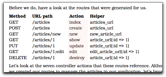
Look in articles_controller.rb, and you’ll find a skeleton for the index method (produce a list of all the articles), the create method (to add a new article to the database), and so on.

Ah… working with ease. But is it the right work? In my case, this ease of work was one of the things that led me away from what I should have been concentrating on: who’s the most important user of the website, and what’s the most important thing she wants to do? As it turns out, it’s none of the REST operations. As I merrily filled in the blanks Rails gave me, I was not doing the most important thing first, and I think it likely that I was leaning toward a worse user experience.

Links

Jason Gorman:

Contrary to - well - pretty much the entire software industry, I don’t believe that a software architect is someone who designs software. I believe that a software architect is someone who recognises a good software design when he sees one.

A Rails homage to the “I’m a Mac” commercials (via /\ndy)

The Wall Street Journal published an editorial containing this graph:

Bogus curve fitting

In what possible universe could you honestly fit that curve to that data? Who could, without shame, publish a curve that goes around the bulk of the data? One that goes through an obvious outlier? (Tukey’s brilliant and eccentric Exploratory Data Analysis counsels us to understand outliers before worrying about the “central tendency”. I wonder if the anonymous editorialist wondered what might be special about Norway? Perhaps a particular natural resource, drilled from under the ocean? If only there were a tool one could use to find information about that resource’s contribution to Norway’s GDP or any special tax rate applied to it!)

But, self-doubting liberal that I am, I can’t only conclude that unsigned Wall Street Journal editorials are written by people whose preferences and loyalties have made them—to use the precise academic terminology—bullshitters, people to whom the truth is completely irrelevant. I have to wonder to what degree I do the same thing, to what degree my own comfort and self-interest has led me to push back against the whole post-Agile thing, despite my respect for Jonathan Kohl and Jason Gorman.

Fortunately, I have morphing software to play with, so I can cut self-reflection short.

Hat tip to Economist’s View

Graphical workflow tests for Rails - alpha version released

For many web apps, it’s important to get the user’s workflow right. Consider a Rails app that uses some variant of acts as authenticated to handle user registration and login. Here’s one way of describing an example of normal registration:

John visits the home page.
John follows the “sign up” link.
(John is now on the signup page.)
John signs up as “john”, email “john@example.com”, password “sloop”.
(John is now on the welcome page.)
John waits for activation email…
John clicks on a URL ending in an activation code.
(John is now on the login page.)
John logs in as “john”, password “sloop”.
(John is now on the member page.)

Here’s another:

A registration workflow

Which is better? If I were trying to design the workflow—get it so that it’s right for the users—I’d much rather use a picture (whether drawn in OmniGraffle, as this was, or on a napkin or whiteboard.) Why?

  1. It’s easier to “zoom out” from a picture, to ignore the details. When I do that, I’m more likely to notice missing workflows or stupidities in the ones that I have.

  2. As a designer, I’ll soon have to explain my thinking to others. It’s easier to explain a picture because it’s sitting right there in front of both of you, visible in two-dimensional space. It’s simple to refer to something you already mentioned: point at it. A wealth of context gets recalled by that simple gesture. If it’s not readily recalled, you can decorate the graphic with something that jogs the memory. Pictures make for a much more fluid way of communicating.

  3. Our minds are in bodies; and bodies have minds of their own. We think kinesthetically and visually, not (just) by banging propositions together according to the rules of some kind of logic. The more ways you think about something, the fewer mistakes you’ll make.

But there’s one big disadvantage of pictures from the point of view of the test-driven (behavior-driven, example-driven) programmer: they’re not executable.

Until now

I’ve released an alpha version of an open-source library that converts such pictures into Ruby tests. Below the fold, I show how the workflow picture becomes a Rails integration test.

✂——✂——✂——✂——✂——✂——✂——✂——✂——✂——
(more…)