Archive for the 'exampling' Category

Graphical workflow tests for Rails - alpha version released

For many web apps, it’s important to get the user’s workflow right. Consider a Rails app that uses some variant of acts as authenticated to handle user registration and login. Here’s one way of describing an example of normal registration:

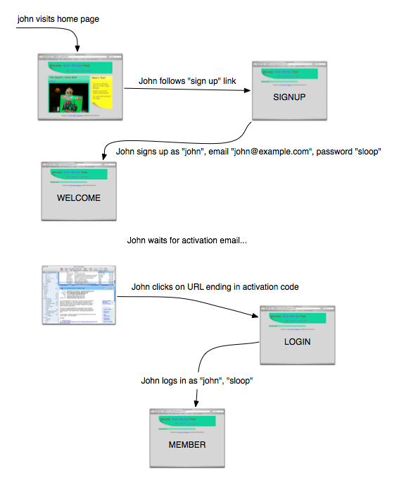
John visits the home page.
John follows the “sign up” link.
(John is now on the signup page.)
John signs up as “john”, email “john@example.com”, password “sloop”.
(John is now on the welcome page.)
John waits for activation email…
John clicks on a URL ending in an activation code.
(John is now on the login page.)
John logs in as “john”, password “sloop”.
(John is now on the member page.)
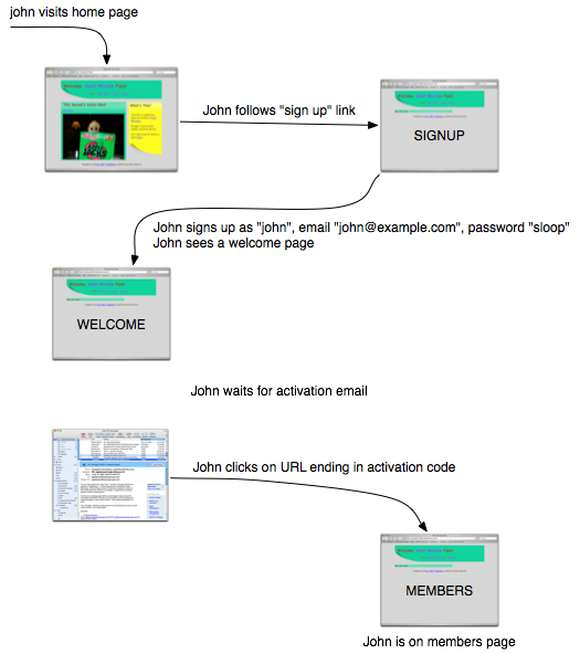
Here’s another:

A registration workflow

Which is better? If I were trying to design the workflow—get it so that it’s right for the users—I’d much rather use a picture (whether drawn in OmniGraffle, as this was, or on a napkin or whiteboard.) Why?

  1. It’s easier to “zoom out” from a picture, to ignore the details. When I do that, I’m more likely to notice missing workflows or stupidities in the ones that I have.

  2. As a designer, I’ll soon have to explain my thinking to others. It’s easier to explain a picture because it’s sitting right there in front of both of you, visible in two-dimensional space. It’s simple to refer to something you already mentioned: point at it. A wealth of context gets recalled by that simple gesture. If it’s not readily recalled, you can decorate the graphic with something that jogs the memory. Pictures make for a much more fluid way of communicating.

  3. Our minds are in bodies; and bodies have minds of their own. We think kinesthetically and visually, not (just) by banging propositions together according to the rules of some kind of logic. The more ways you think about something, the fewer mistakes you’ll make.

But there’s one big disadvantage of pictures from the point of view of the test-driven (behavior-driven, example-driven) programmer: they’re not executable.

Until now

I’ve released an alpha version of an open-source library that converts such pictures into Ruby tests. Below the fold, I show how the workflow picture becomes a Rails integration test.

✂——✂——✂——✂——✂——✂——✂——✂——✂——✂——
(more…)

Graffle 0.1.0 released

As far as I know, there’s only one other person in the world who cares about testing Rails apps from OmniGraffle documents. (Hi, Tom!) Still, since I always make a fuss to clients about how important it is to reinforce discipline and ease the release process by frequently releasing potentially usable product as widely as possible—and since I believe what I say—it’s time for a release:

The first, minimally bearable version of my OmniGraffle parser/decorator is available for download. You can also read the documentation online.

Picture of graffle documentation

Choose images

On a lighter note, I’ve decided to make up exampler.com t-shirts, posters, and whatnot. Since I want them to help rally the masses behind my recent themes, I’m going with a Soviet propaganda poster sort of style. In order to offend the shade of that monster Stalin (who forced the style on Soviet artists), I’ll sell these trinkets online (eventually), have my children do fulfillment, and let them pocket the profits—thus encouraging them in capitalism (not that they need it).

Here are two rough mockups. Which do you prefer?

Man putting up a poster

ringing a bell

Graphical tests again

I’m spending the summer getting good enough at Rails to fit in at Rails Edge. To do that, I’m creating a website for my kids.

Recently, I plugged in Acts As Authenticated to do signup, login, authentication, and the like. Since I’m messing around with that plugin’s workflow, this seemed like a good opportunity to write workflow tests (which, in Rails, falls under the category of “integration tests”). Here’s my first test, which follows something like the “Even Higher-Level Tests” style in section 13.4 of Agile Web Development With Rails:


  def test_normal_signup
    dave = new_visitor
    dave.starts_at ‘home page’
    dave.goes_to ’sign up page’
      (dave.is_at ’sign up page’)
    dave.enters :login => ‘dave’, :email => ‘dave@example.com’,
                :password => ‘dave332′, :confirm_password => ‘dave332′
      (dave.is_sent_registration_email)
      (dave.is_at ‘welcome page’)
      # Dave goes away
     
    dave_next_day = new_visitor
    in_email {
      dave_next_day.has_clicked_on_link_to ‘confirmation page’, dave.registration_code
        (dave_next_day.is_at ‘members page’)
    }
  end

But even as I wrote it, I became discouraged. It’s English-like, yes, but it’s still not terribly skimmable. Answers to questions like “Where do you go after you signup?” don’t leap out at you. Is this really a format that’s going to help people either communicate or make sense of paths through a set of pages?

So I fell back on my ideas about graphical tests and drew the following. (Click the picture for a larger pdf.)

A flow through screens

That took longer to draw than it did to write the first test, but actually not a whole lot longer. What do you think? Should I go to the trouble of reimplementing my OmniGraffle parser in Ruby and finish implementing the test? (The good thing about doing that is that it seems like Rails programmers all use Macs, so there’s actually a chance that a test framework I built would get used.)

My first marketing event in sixteen years of business

Various people have spoken approvingly of this sticker on my laptop:

an example would be handy right about now

I’ve just ordered a pile of them. I will send you one if you send me your surface mail address. You have to promise to stick it somewhere, not toss it in a drawer or a pile of papers.

Offer good until I get tired of it. I do not guarantee that the stickers peel off well. (The one on my Macbook was tattered after six months of daily travel in my backpack. It came off pretty well, in two big strips, but left some glue behind.)

I’ve also created a new sticker:

an example would be handy right about now

This, I think, makes a good personal goal. It’s also the way I describe products developed in an Agile style. I say they start out wrong (or crummy), but get less wrong every iteration. They should stop getting less wrong when it’s no longer worth making them so.

Offer is good on these stickers too, under the same conditions.

(I wanted to write here something witty about the chance of me reusing or selling addresses, but I couldn’t think of anything. I wouldn’t worry about it, were I you.)

Mob-FAT 2: Omit needless words

Earlier in the series:
Controller channels

“Omit needless words” is number 13 of Strunk&White’s elementary rules for composing English. It’s a pretty good rule for composing tests, too, but not followed often enough. Let’s rewrite an example of the sort of test I often see.

(more…)

The tenth time you say it, decide that it’s wrong

That title seems like a good motto in general. Here’s a specific instance.

I was on a short consulting trip recently. We talked about Fit. I said the two things that I’ve said to clients at least ten times:

“I recommend using Fit when the product director wants to read the tests or when the data is naturally tabular. If the product director doesn’t care or if the test is a do-this-do-that-check-this type test, I’d rather you used xUnit.”

“There are no decent HTML editors. The most tolerable I’ve found is OpenOffice, but they’re all a pain when you want to modify tables.”

There’s a contradiction here. If the product director doesn’t care, why would you write a tabular test in HTML? Because using xUnit means you have to keep columns aligned, and that’s a pain. So use HTML and have the browser line up the columns. But I just said that editing HTML is also a pain. And I never gave much thought to which is the greater pain.

(more…)